The YMCA of the USA
Retooling an intranet to improve functionality and brand cohesion.

Overview
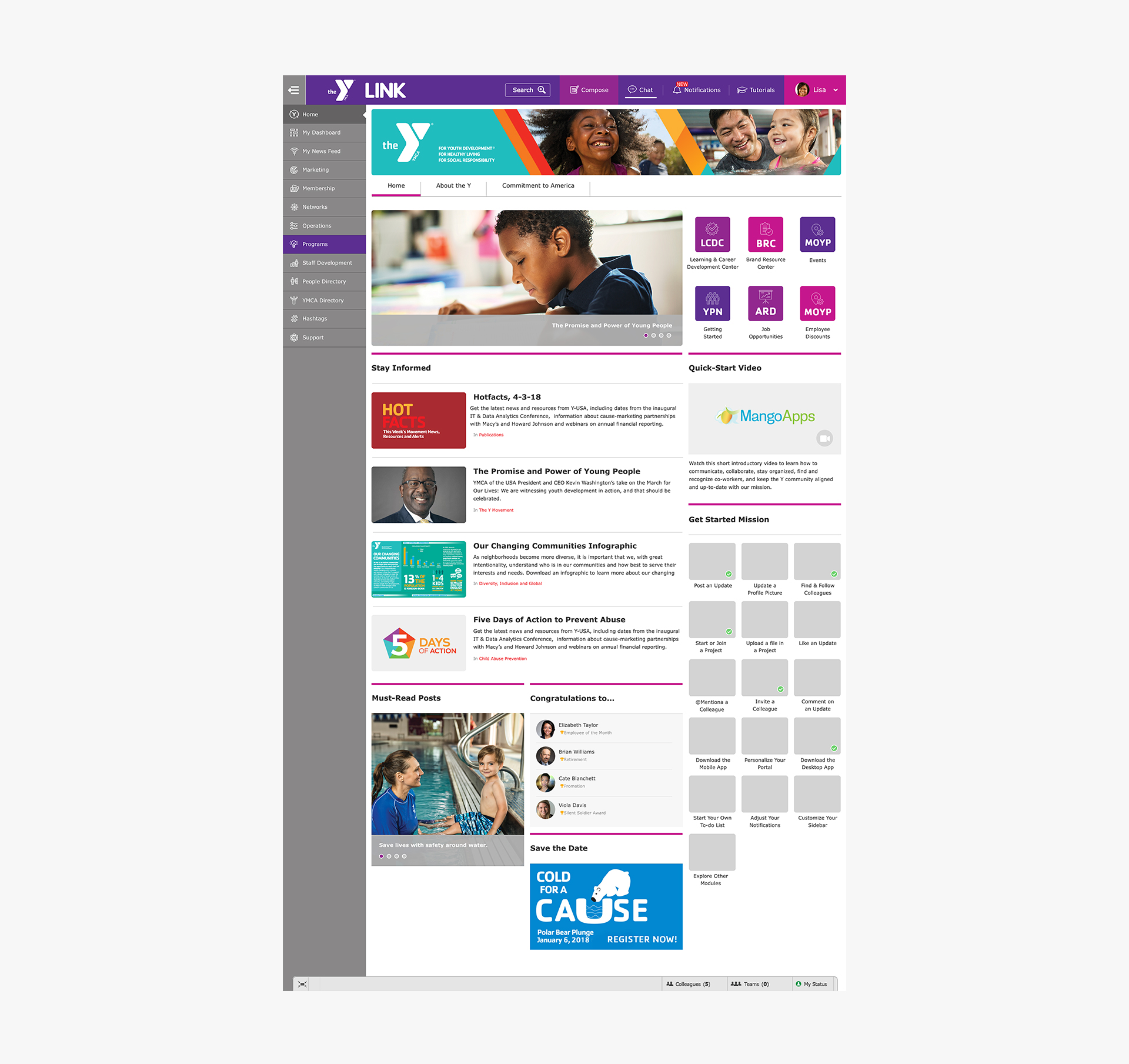
The YMCA of the USA is the national resource office for the Y. The Y is one of the nation's leading nonprofits strengthening communities through youth development, social responsibility and healthy living. Their most recent intranet design didn't seamlessly integrate into their current visual language. I was tasked to retool the interface so it aligned with the Y's current brand. Usability edits, icon design and style guides were interwoven through the redesign process.
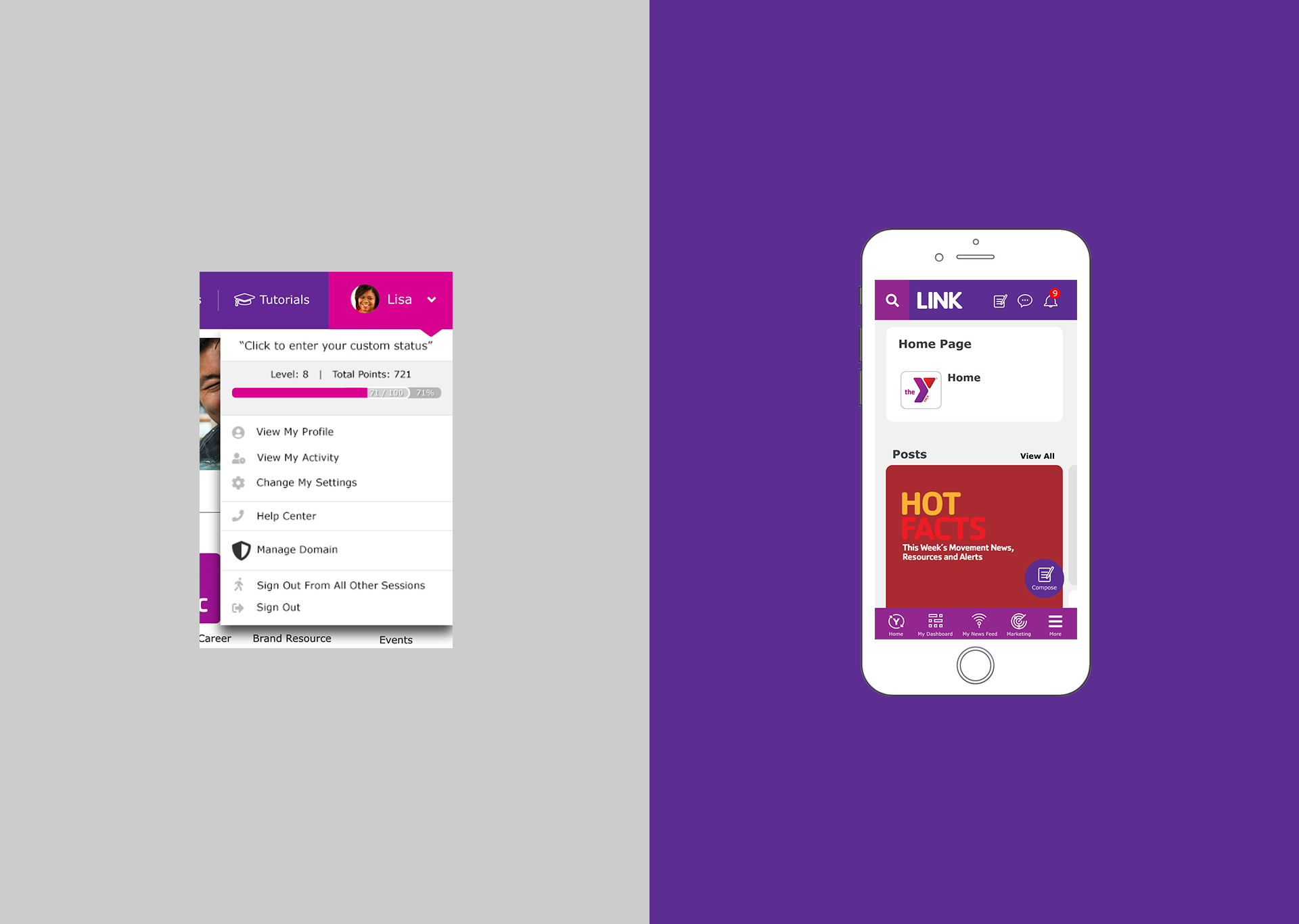
Dropdown Menu
The Y needed to customize their dropdown menu to enhance it's functionality. Input from staff was utilized to determine the best solution. A "level-up" bar was incorporated to enhance staff participation for various trainings and task completion.